Firestone
Friendlier search results for an e-commerce tire giant.

Led Redesign of Search Results UX for a Leading E-Commerce Tire Retailer
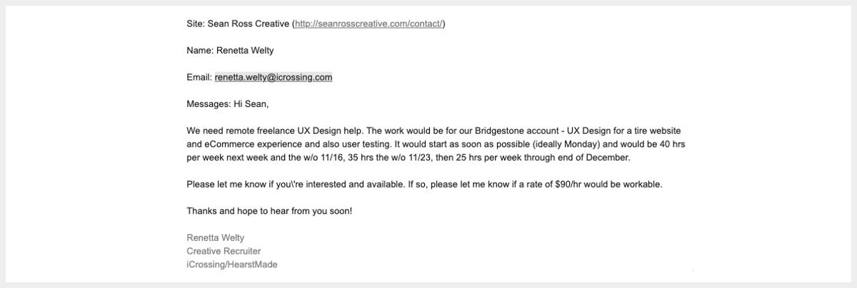
In early November, I received an inquiry through my contact form from Renetta Welty, the lead talent source at iCrossing, a design agency owned by Hearst Media Corporation.
Project Brief and Kickoff
The design lead originally slated for the project was let go at the last minute, and the client’s end-of-year needs were paramount to the agency, as Bridgestone is a major client. After a call with Steve Shay, iCrossing’s ECD, I was determined to be a good fit and briefed the next day. Steve walked me through the deck the team had prepared, and we spent time reviewing the Bridgestone platform (Firestone’s parent) and several key competitors, all with interesting UI/UX differentiators.
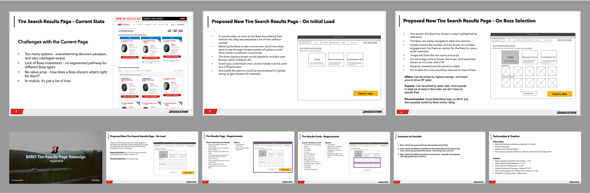
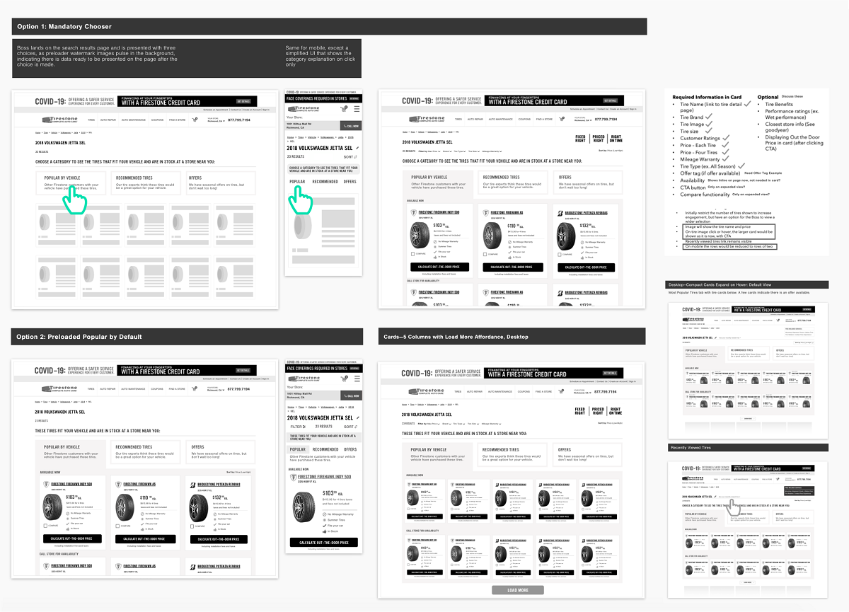
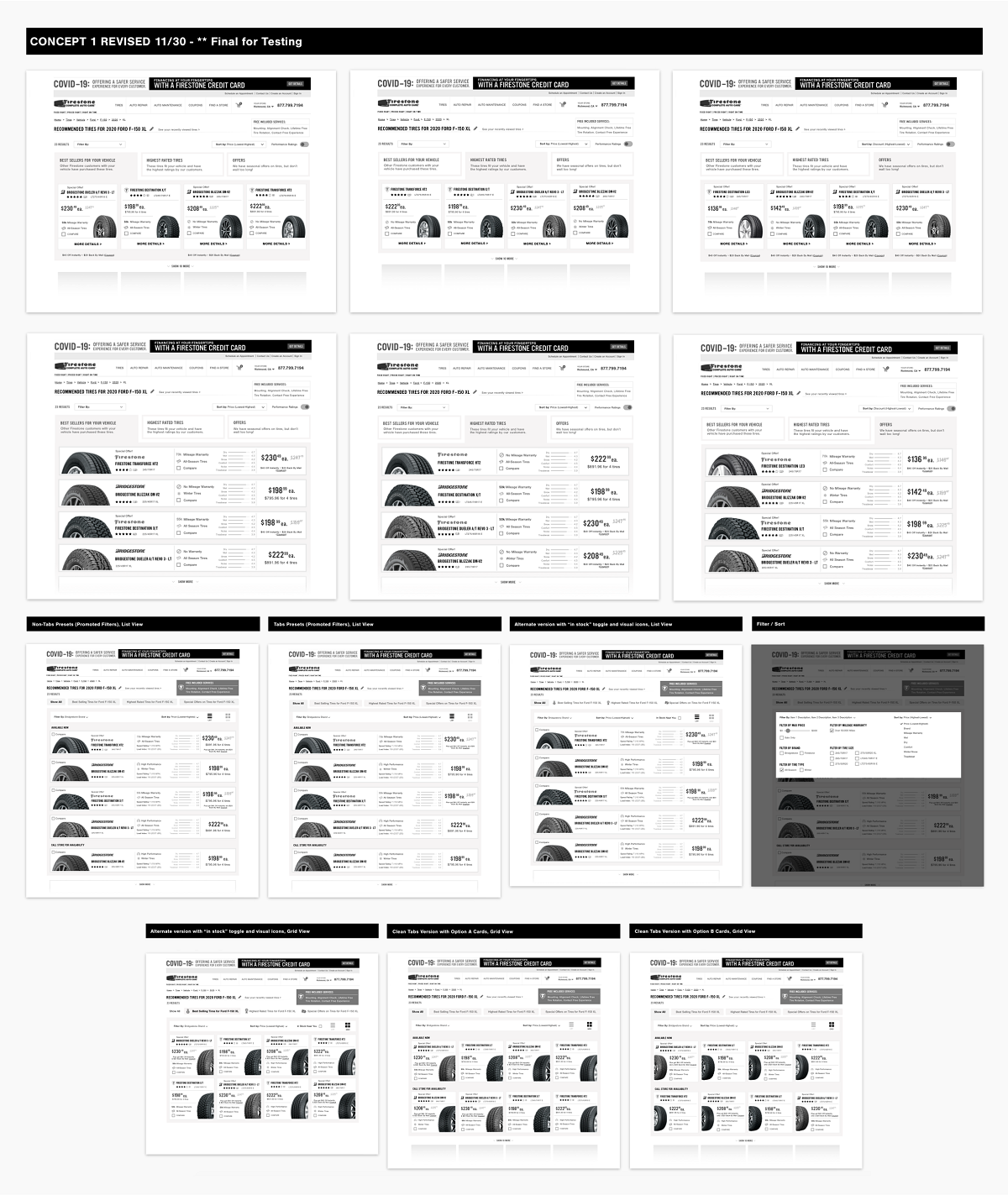
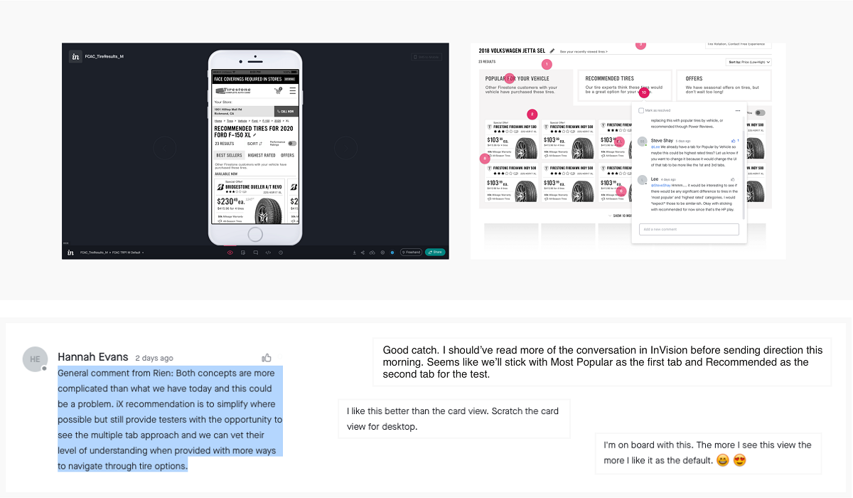
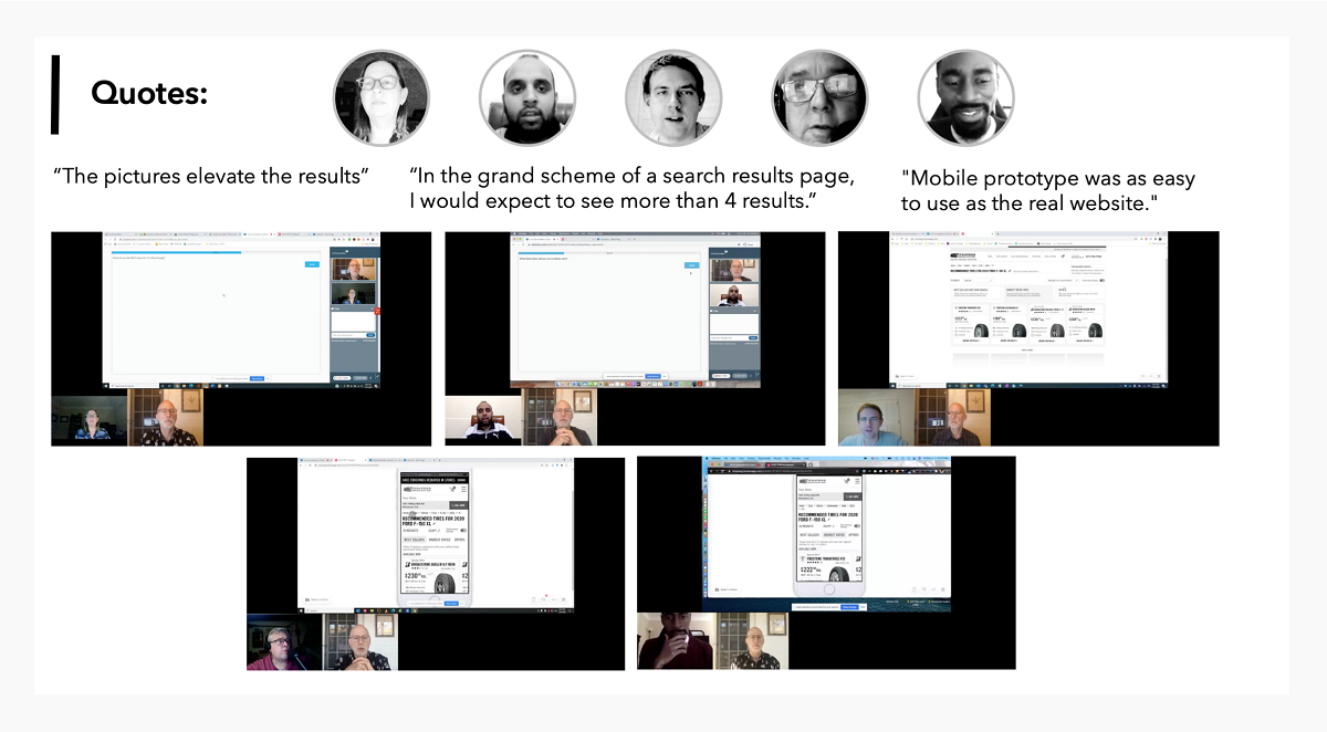
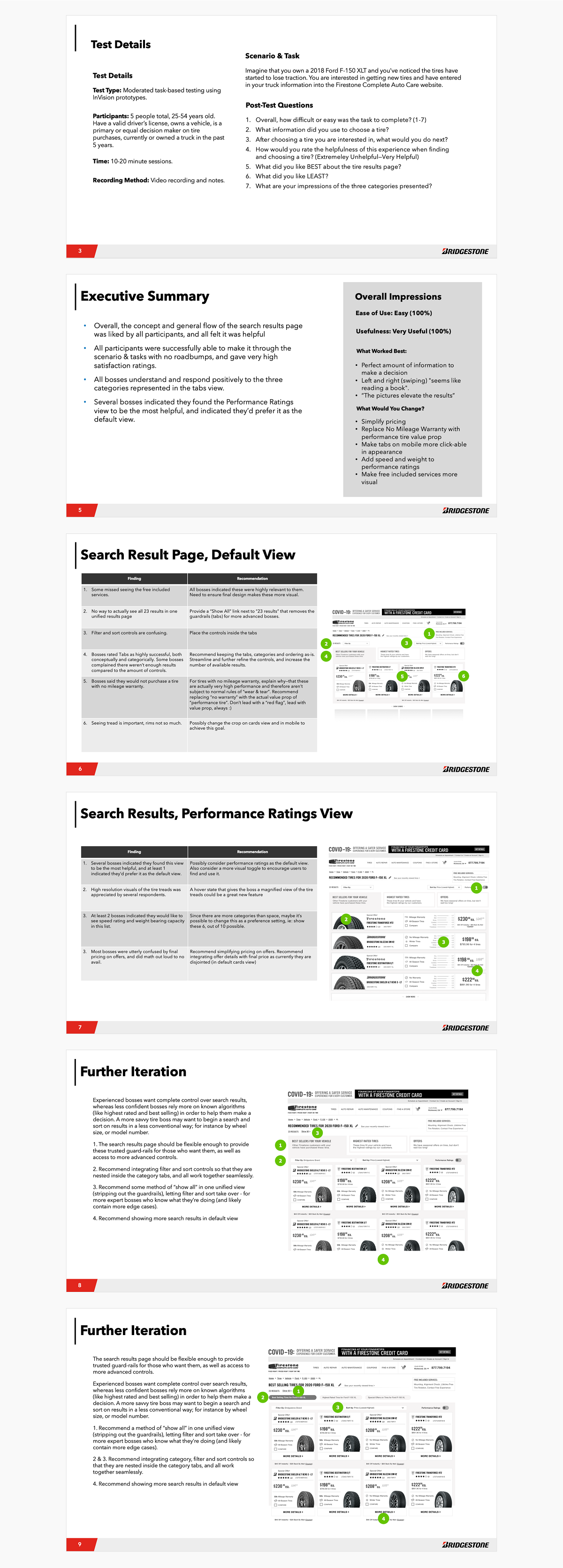
The brief focused on a cleaned-up version of a napkin sketch from the client team, proposing a solution to the core problem — option overload. The plan: deliver a refined, workable iteration on that idea while building our own ideas in parallel, present to the client, test everything with real customers, then refine before implementation.
Core Objectives and Challenges
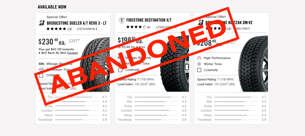
- Too many options — overwhelming decision paralysis, very catalog-esque
- Lack of “Boss” investment — no segmented pathway for different buyer types
- No value prop — how does a Boss discern what’s right for them?
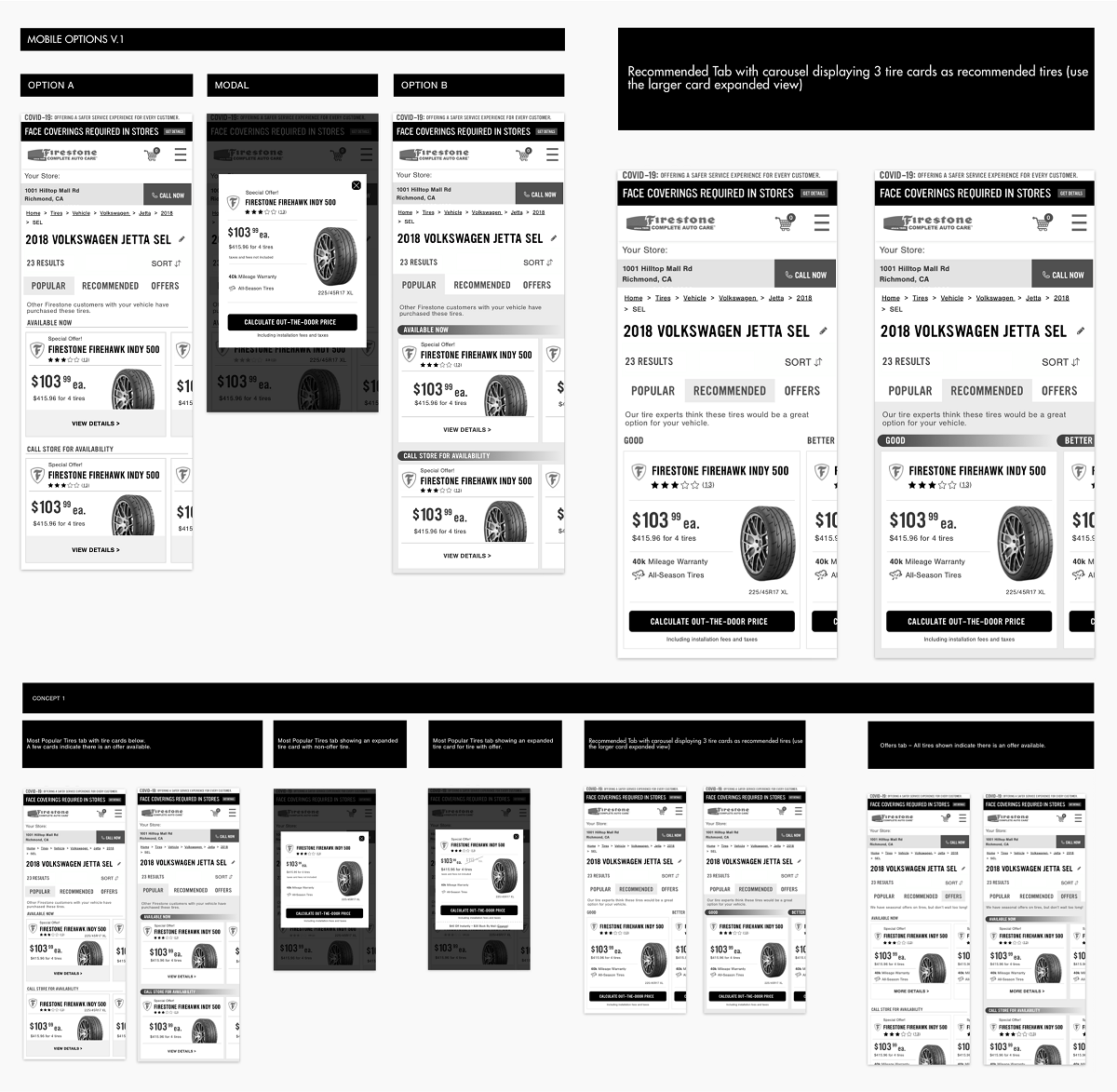
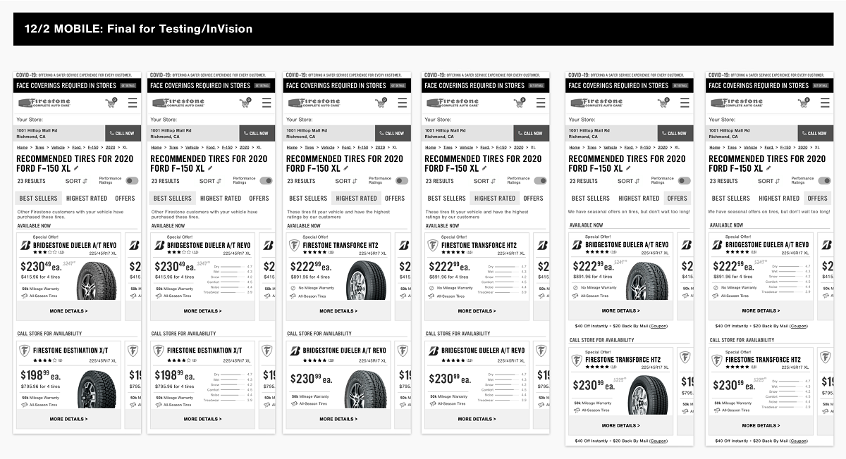
- On mobile, it’s just a list of tires

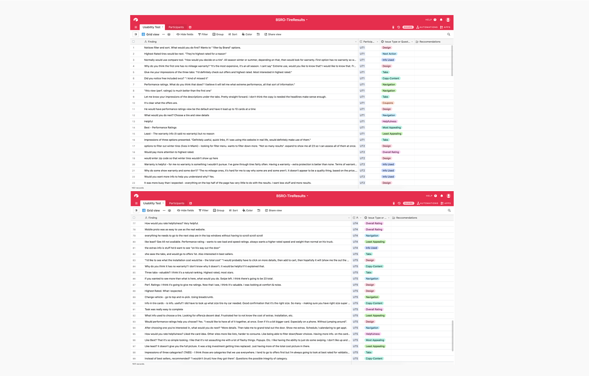
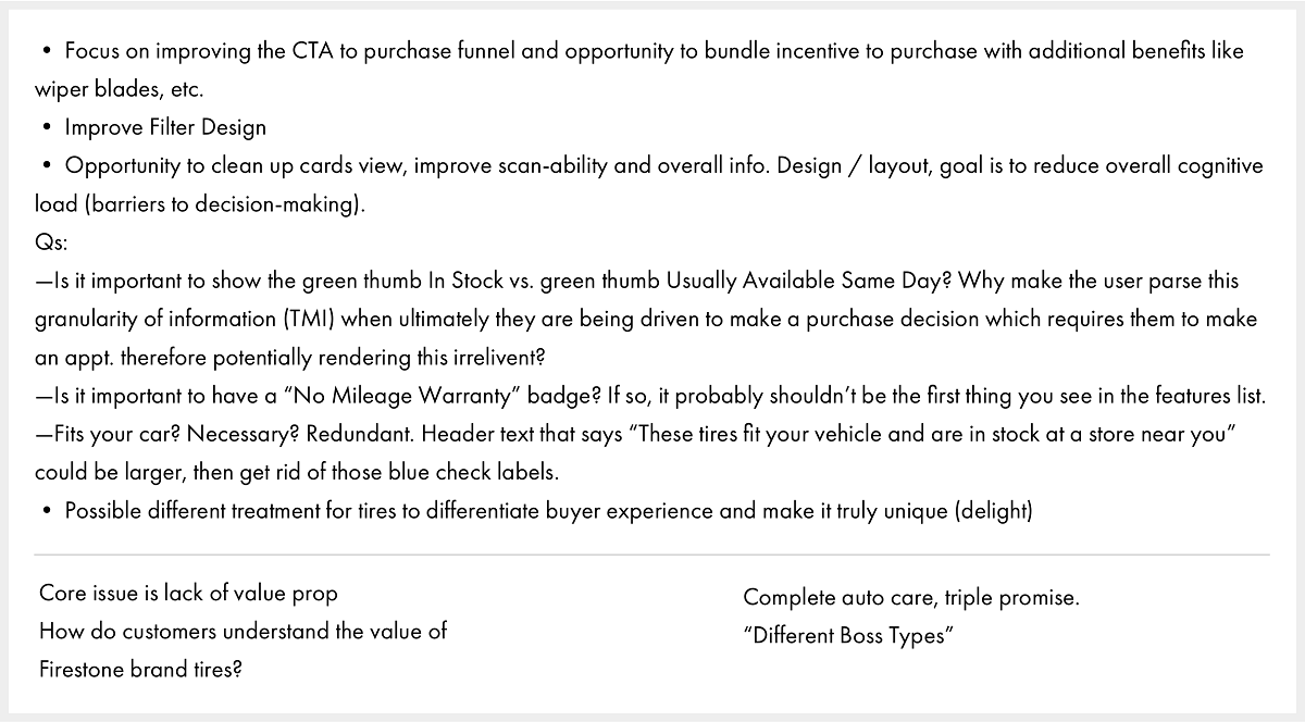
I’m often brought into projects that benefit from Beginner’s Mind. Agencies are often so close to the client, and clients so close to their businesses, that “out of the box” thinking is rare. Early on, I fully document my observations about a product experience without “knowing too much,” letting intuition lead me toward greater opportunities — while managing the brief’s objectives with utmost care.
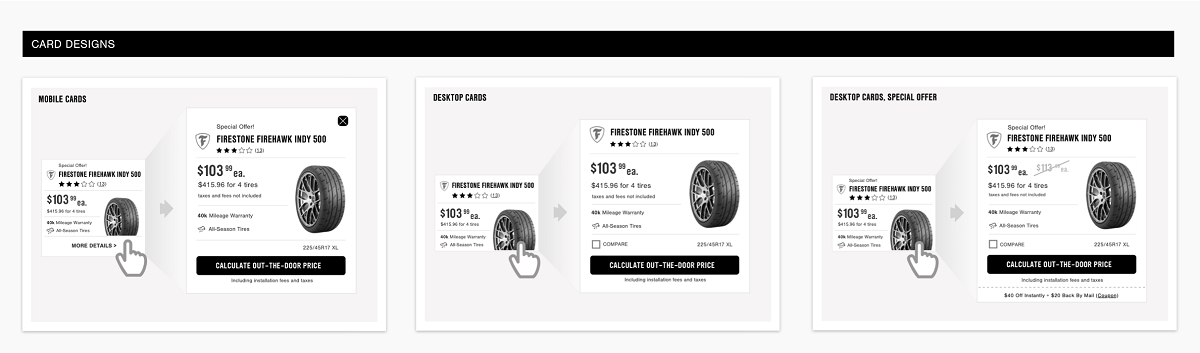
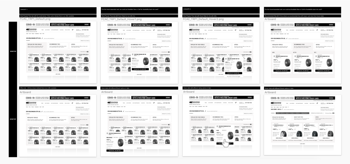
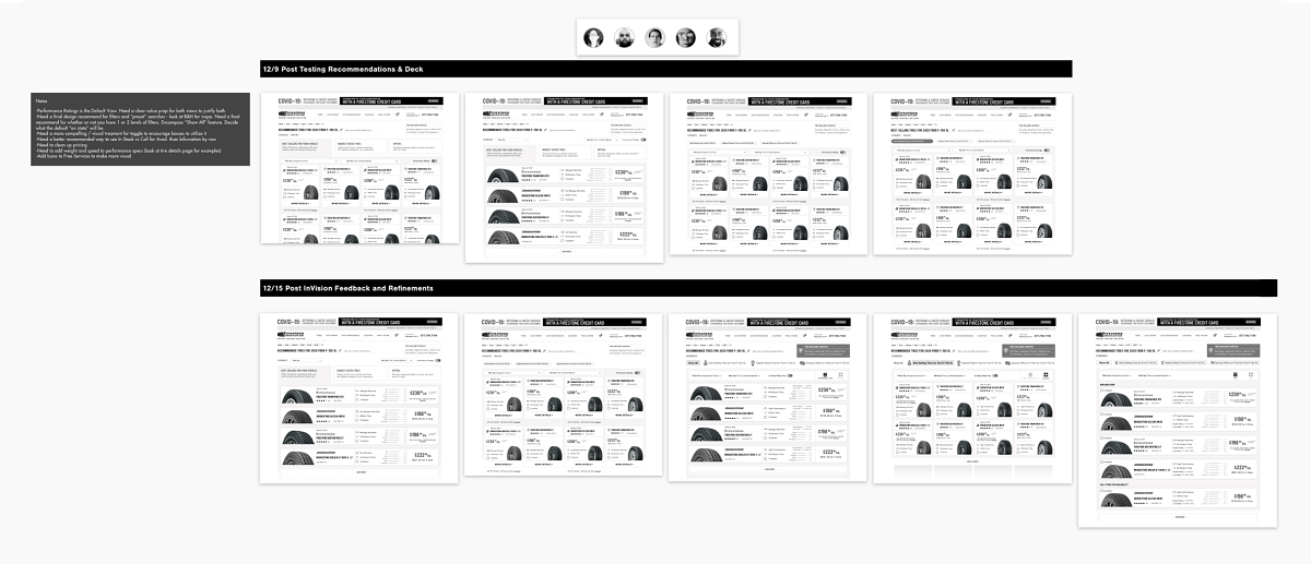
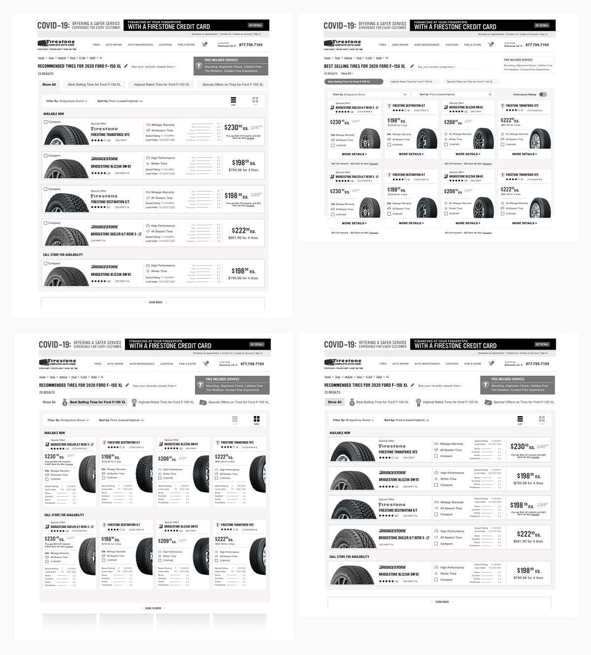
The first phase of deliverables focused on the core idea in the brief: simplifying search results by folding them under pre-populated categories — shown with and without a default already selected.