Espressive!
Gartner Cool Product 2019
Head of Design for Groundbreaking Enterprise AI SaaS Product
Recruited for VP of Design (2016-2019) for a groundbreaking B2B SaaS company in the Enterprise Service Management space.
Designed and launched an extremely well-received MVP in 9 months, ultimately leading to a successful 30M Series B round. Established consumer-facing branding, marketing, chatbot personality, and a myriad of innovative product features.
Espressive has continued to garner significant industry praise, market traction, and several awards from Gartner & others.
Process involved: competitive analysis and market research; rapid ideation, prototyping, testing and evaluation of core MVP features using an agile framework; working hand-in-hand with engineering to get features built and shipped, ensuring subsequent issues adequately addressed with CX team; hiring, leadership & growth of core design team; helping create a positive and healthy company culture, making Espressive an exceptional place to come to work every day.

Espressive is focused on automating complex issues in the enterprise service management environment.
At its core is an AI powered virtual assistant, Barista.
The Problem Space
Espressive was started by two former executives from ServiceNow, in order to address a fairly significant lack in ServiceNow’s business model.
ServiceNow was pretty good at delivering great technology but left the User Experience part of that equation for the enterprise to figure out for themselves. Since helpdesk service desk professionals aren’t terribly gifted at creating user experiences that people want to engage with-go figure-where the rubber met the road, there wasn’t a whole lot of love for ServiceNow. But customers ultimately lacked any viable alternative. Sounds like a familiar scenario, doesn’t it?
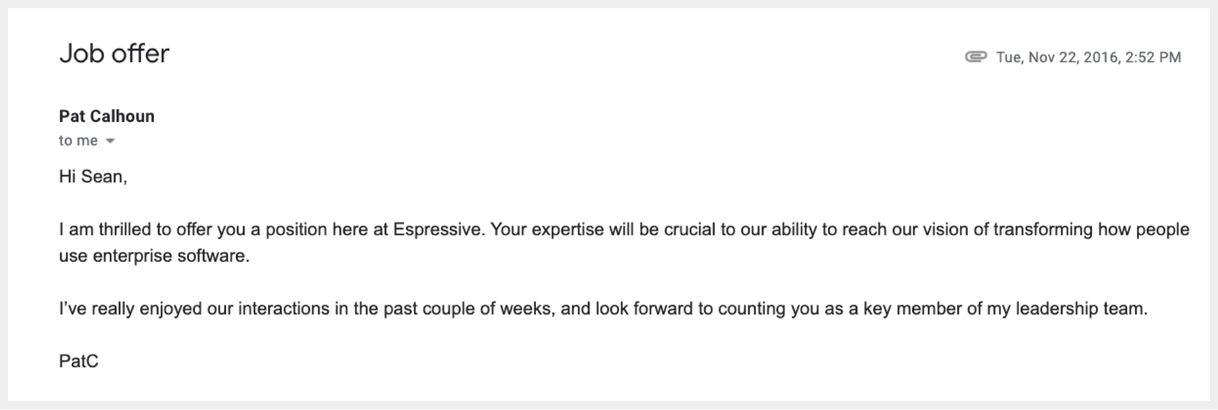
After receiving a cold response by the top brass at ServiceNow to their revolutionary ideas, Pat Calhoun and Fran Fernandez set out to disrupt the status quo of a deeply entrenched organization, at the fore of a 30 billion dollar industry. Their aim was to couple the strengths of ServiceNow’s business model with exceptional consumer-grade user experiences and cutting edge artificial intelligence. They met me in the fall of 2016 through Angel List’s A-List program, and after a few conversations, invited me to come aboard as their Head of Design, Employee #5. I was thrilled to be given a new opportunity space to bring my expertise into a new frontier that seemed to desperately need it.
Expressive Value Proposition
Espressive is designed to replace highly unpopular, oft-avoided corporate web portals with natural language chat-based workflows designed to resolve simple problems instantly, and more complex issues more efficiently — through automation and machine learning, and interoperability with existing enterprise “systems of record”, such as Service Now. The core concept is one universal touchpoint to get your issue resolved. Behind the scenes, Barista uses natural language processing and neural networks to understand employee requests, and machine learning to predict the right department (IT, HR, Facilities).
Web Portals and Knowledge-base articles are the standard means for employees to get help at work, but they have an extremely low adoption rate (10–15%), and for good reason — they’re poorly designed, difficult to use and navigate, not well maintained, and lack the simplicity and effectiveness we’ve come to expect from consumer-grade user experiences, but unfortunately are still sorely lacking in the workplace.
When employees can’t find the answer they need, they open a case and wait in line. These issues are usually urgent in nature—meanwhile, work responsibilities are put on hold… sort of like being stuck at the DMV. Barista automates many of the most common front-line use cases, allowing employees to get back to doing what they were hired to do, while allowing internal help experts to focus on key business initiatives, instead of soul-destroying repetitive tasks. It’s an important point to make that AI and automation often isn’t setting out to replace or eliminate the jobs of human beings, but to make those existing jobs more viable—to offload the “grunt work” to automated systems that can actually do a better job at it, because unlike humans, software and AI actually love tedious jobs. 85 to 90% of employees pick up the phone or send an email to ask a question, rather than searching portals or intranets. (I’ve never seen a corporate web portal that didn’t make me want to self-harm).
Instead of learning how to navigate a portal site that was designed by an intern in 1998, I always make an effort to befriend my IT person. Chances are high they will either be saving my ass the next time I spill coffee on my laptop (just before the big presentation)—or telling me to wait in line. Preemptively voting Superman over Lex Luthor with Kindness in the right place can make your life imminently more stress-free. Apply this rule with abandon.
Barista provides employees with immediate answers to questions and resolutions to issues, easily guiding them through otherwise complex and daunting processes. Employees are far more productive as a result.

A primary example — a simple password reset ends up costing companies dearly — in both downtime for employees, as well as in-person help desk assistance. A simple password reset accounts for up to 30% of all IT related service desk calls—an insane waste of human energy. Barista can re-set a password and have an employee back up and running in no time. You won’t even have time to run to the bathroom. But seriously, go ahead, please.
Onboarding of new hires is typically fraught with complexity that companies don’t know how to manage well, if at all. Barista solves this problem by combining complex tasks involving multiple constituencies into easy to complete workflows that allow new hires to get up and running fast. Companies with effective onboarding see a 50% increase in new hire retention. Barista integrates the onboarding process with HR and IT systems — new hires easily complete all onboarding paperwork through Barista and have their systems waiting for them at their desks on their first day in the office. How? Read on, intrepid reader…
An Amazon-like shopping experience allows employees to easily order the equipment and software they need to do their job, without fuss. (That’s how).
Another drain on productivity solved: 30–45% of IT’s time goes to detection and identification of outages after they’ve occurred. Barista identifies outages based on employee issues, notifies employees of the outage, and automatically responds to each outage-related inquiry, resulting in a 40% increase in help desk productivity during these times. Or extra smoke breaks?
Behind the scenes, Barista uses NLP and neural networks to understand employee requests, and machine learning to predict the right department: IT, HR, Facilities and more.
In short:
-Barista Makes it Easy to Get Answers
-Increases New Hire Retention
-Improves New Hire Productivity
Design Process for Espressive
We began our journey working out of the General Catalyst offices—either in downtown Palo Alto, or at their even lovelier South Park location in SOMA, San Francisco. 6 months later, we’d have our very own office in Santa Clara, a stone’s throw from Levi’s Stadium.
Founders with significantly deep expertise in a narrow business vertical have a lot of valuable information to get out on the table, and it’s a designer’s job to open the floodgates in order to access it. I found both Pat and Fran to be great collaborators, each with different perspectives and strengths. We spent many hours talking, debating, sketching and whiteboarding, and ultimately prototyping early iterations on what would eventually become the Espressive MVP.
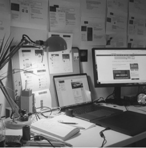
My First Desk
in Palo Alto
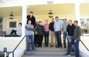
The Espressive Team 1.0,
Palo Alto, Ca.
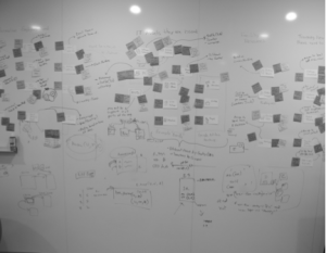
The Espressive
Whiteboard, V.1
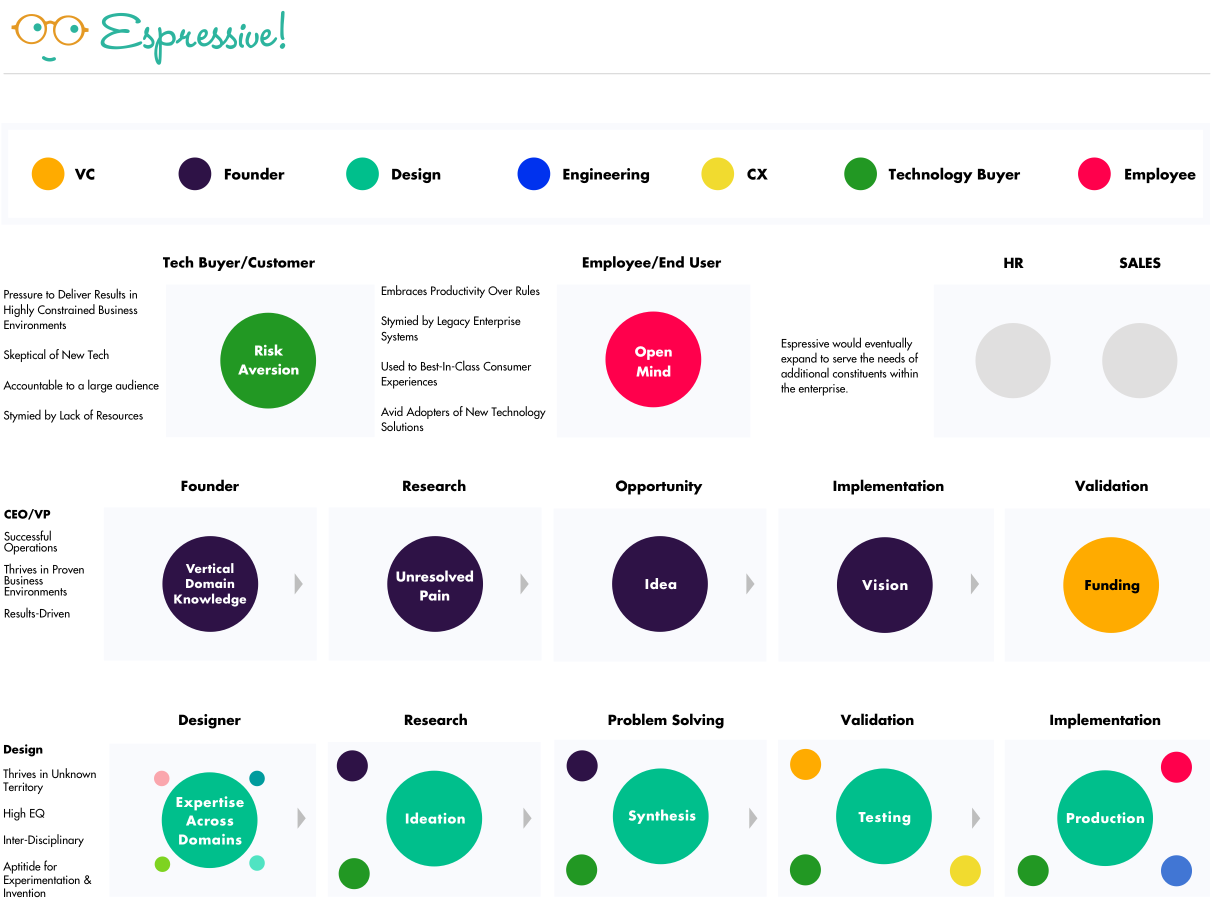
Initial Concept Testing
The early days at Espressive were both challenging and rewarding. Most of what we did during the first 6 months ended up being thrown away. I consider this a healthy practice, if it can be afforded.
The real reason for this, though was the fact that we weren’t yet set up to start building the product yet. The head of Engineering wasn’t due to come aboard until the following summer, the engineering team was still being hired, and systems put into place. By the time we had proper infrastructure, we’d be able to design and deploy significantly faster than we would otherwise have been able to. By then, we’d have made lots of mistakes, and learned a ton in the process.
The main thrust of this work was to quickly get concepts in front of customers for feedback, in order to learn about what resonated and what didn’t. A good deal of up-front effort was spent discussing existing frameworks within the service desk enterprise, and how to differentiate Espressive within that existing environment. From those learnings, we began framing what would ultimately become our Most Viable Product (MVP).
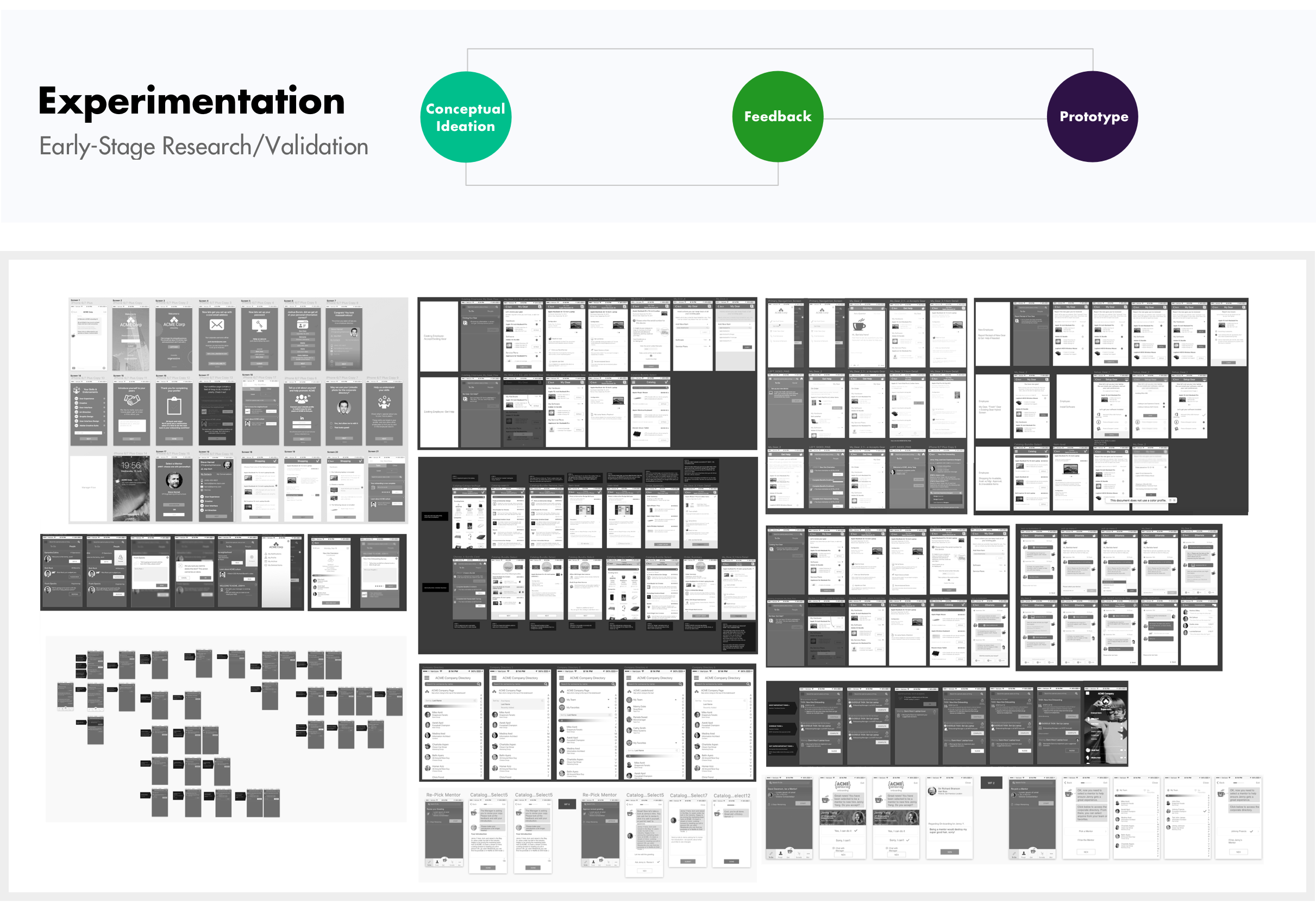
A Collection of Early Wireframes
Ramping Up
Once we had a baseline infrastructure and a fully staffed team, it was time to rock, full steam ahead—no pretending. We needed to start building the product, and our schedule and timeline were agressive.
This involved:
-Collaborating cross-functionally in rapid design sprints to specify & design major features.
-Building approved concepts into Proto.IO prototypes, for testing in the field with prospective customers.
-In parallel, designing the consumer-facing branding and marketing for Espressive’s launch.
-Building core MVP features with Eng. team.
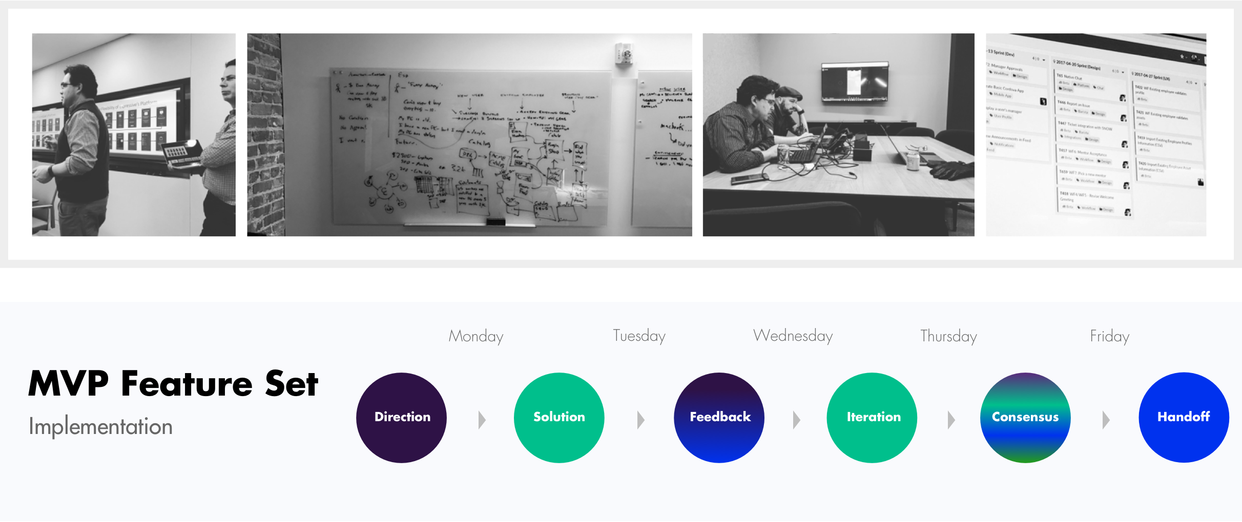
Stealth Design WorkBranding, Marketing, Chatbot Personality & Voice, Third-Party Branding, Trade Show, Collateral, Swag, Interior Design, and 1 Giant Wall Painted Turquoise. Some things are faster & easier, Han Solo style.
|
Highly Collaborative Design WorkHere I am recieving feedback from the team. There’s a bell just in case the meeting goes off the rails. No-one ever rings it because we’ve all learned to talk over each other, like one big happy family of yellers.
|
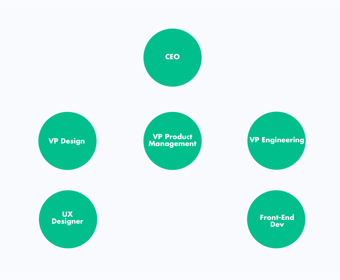
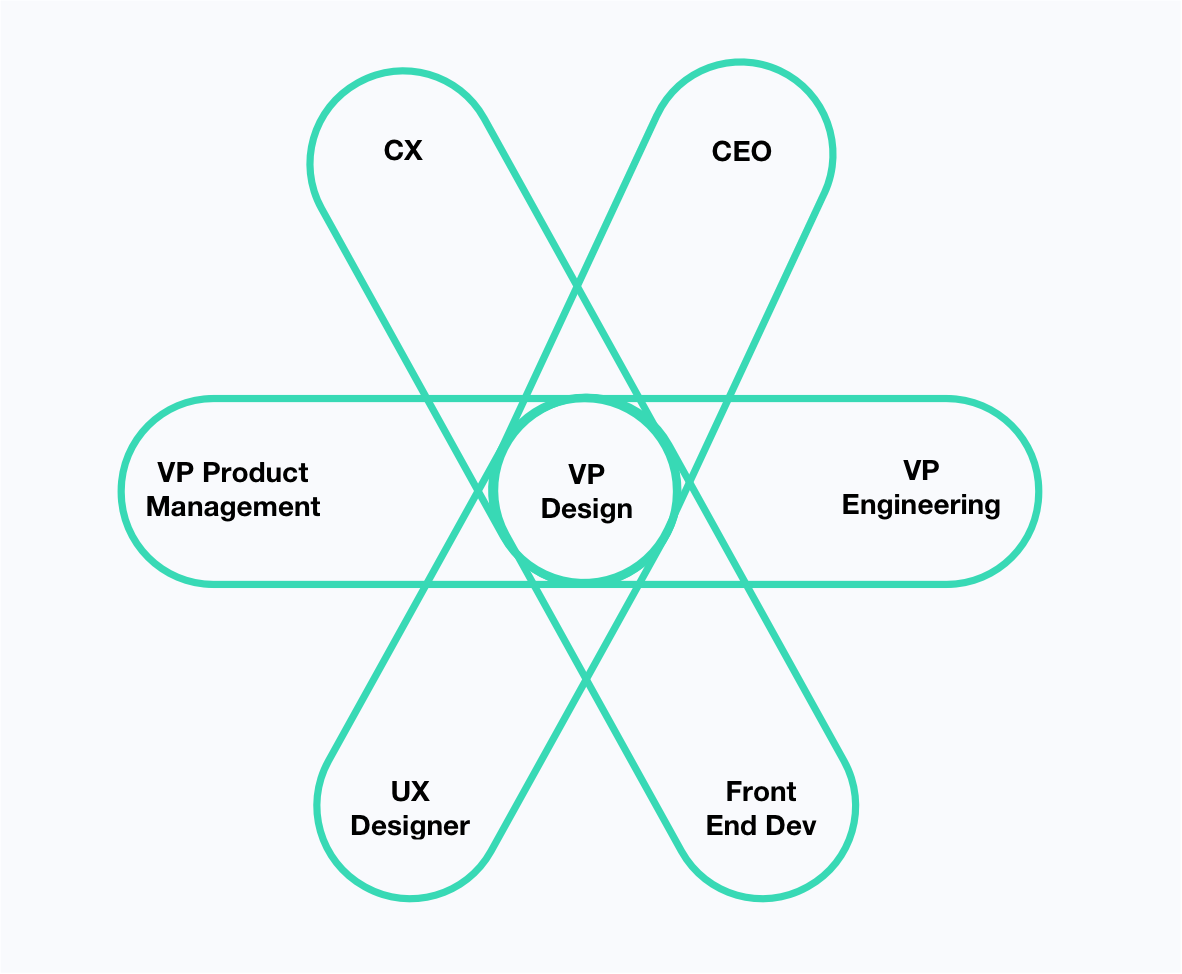
Relationship & Team ManagementMy Design Team: 1 Rogue CEO with Proto.io, 2 Direct Design Reports, 2 VPs, and 1 Hybrid Designer-Developer.
|
In Practice: Discreet Tight LoopsConsensus Building is a lot of walks around the block, 1:1, added up over time.
|
The Espressive Design System for Mobile & Web
As Espressive’s design progressed, a framework was built to codify the differences in layout and interaction models between mobile and web, in order to support and evolve a design system of scalable repeatable patterns across both domains.
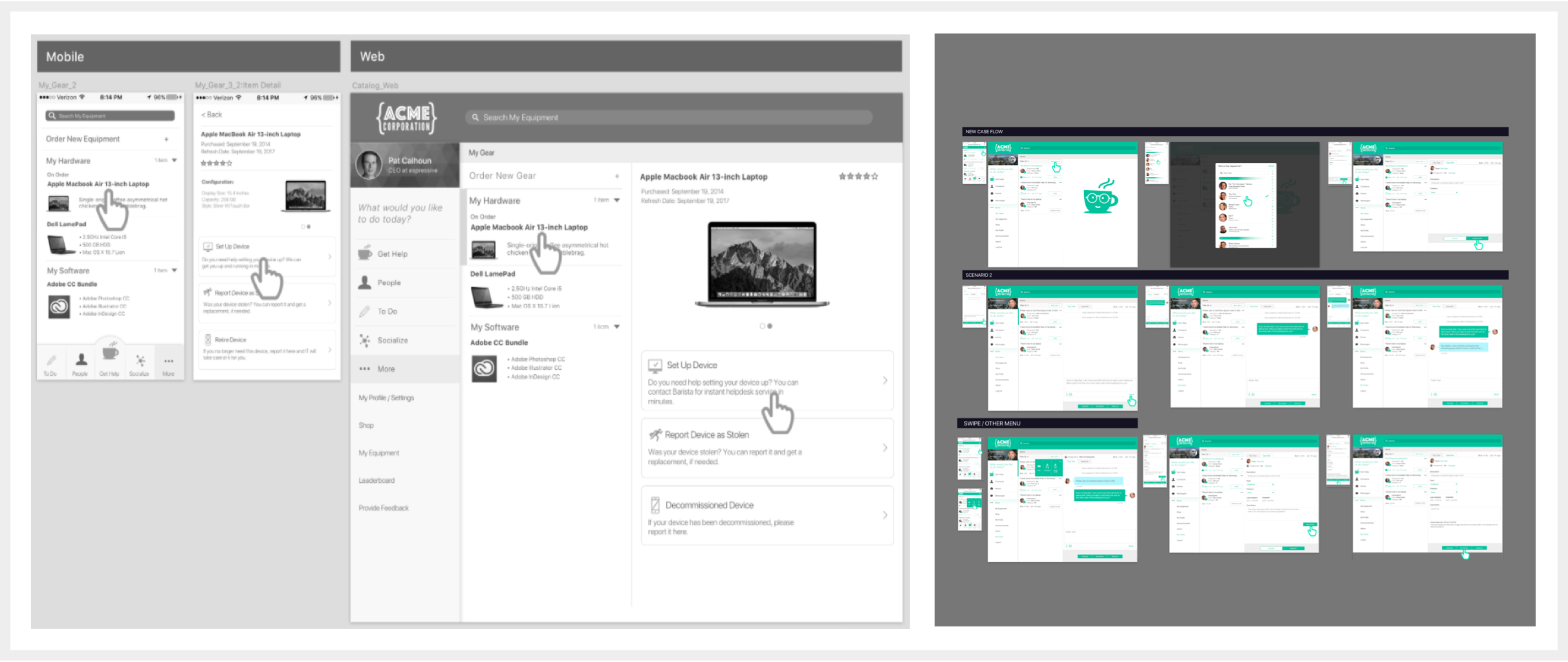
MVP Product Features
Here are the major product features that were designed and deployed in the Espressive MVP:
|
|
|
Branding
There were two very separate and different considerations in branding Espressive that made it slightly more involved than what might otherwise be just another corporate logo. The obvious need to brand the company itself was made slightly more complicated by its relationship to the enterprise customer.
Using Service Now as the model, it was an accepted reality that enterprise customers would want to own—or “skin”, the branding of Espressive, once deployed in the corporate environment. The open question was whether or not Espressive could really be branded at all under those constraints. It seemed a given that Espressive would be a white label product. But if our core differentiator was providing a best-in-class user experiences, wouldn’t we be throwing away that investment if there wasn’t a way for us to visibly associate with those core experiences in the mind of the end user?
I felt it was imperative to find a way to claim ownership over what we were doing. You don’t invest hundreds of hours innovating unique user experiences, and not brand them so that users know who is responsible. How might we convey and imprint our unique value proposition in such an environment?
Around this time I got a ping over Slack from our CEO. It read: Any progress on the logo?
I had been so busy with architecting features and flows, that I hadn’t had a moment to focus on the brand side of things. I began carving out a design brief focused on clarifying in words what a solid brand should accomplish for us, so we’d have something to map the work to.
Espressive also had two very different audience segments for its brand. Our primary paying customer is the IT/HR “buyer” whom we needed to speak directly to and gain trust with. Our primary user (and enthusiastic evangelist hopeful) was the enterprise employee.
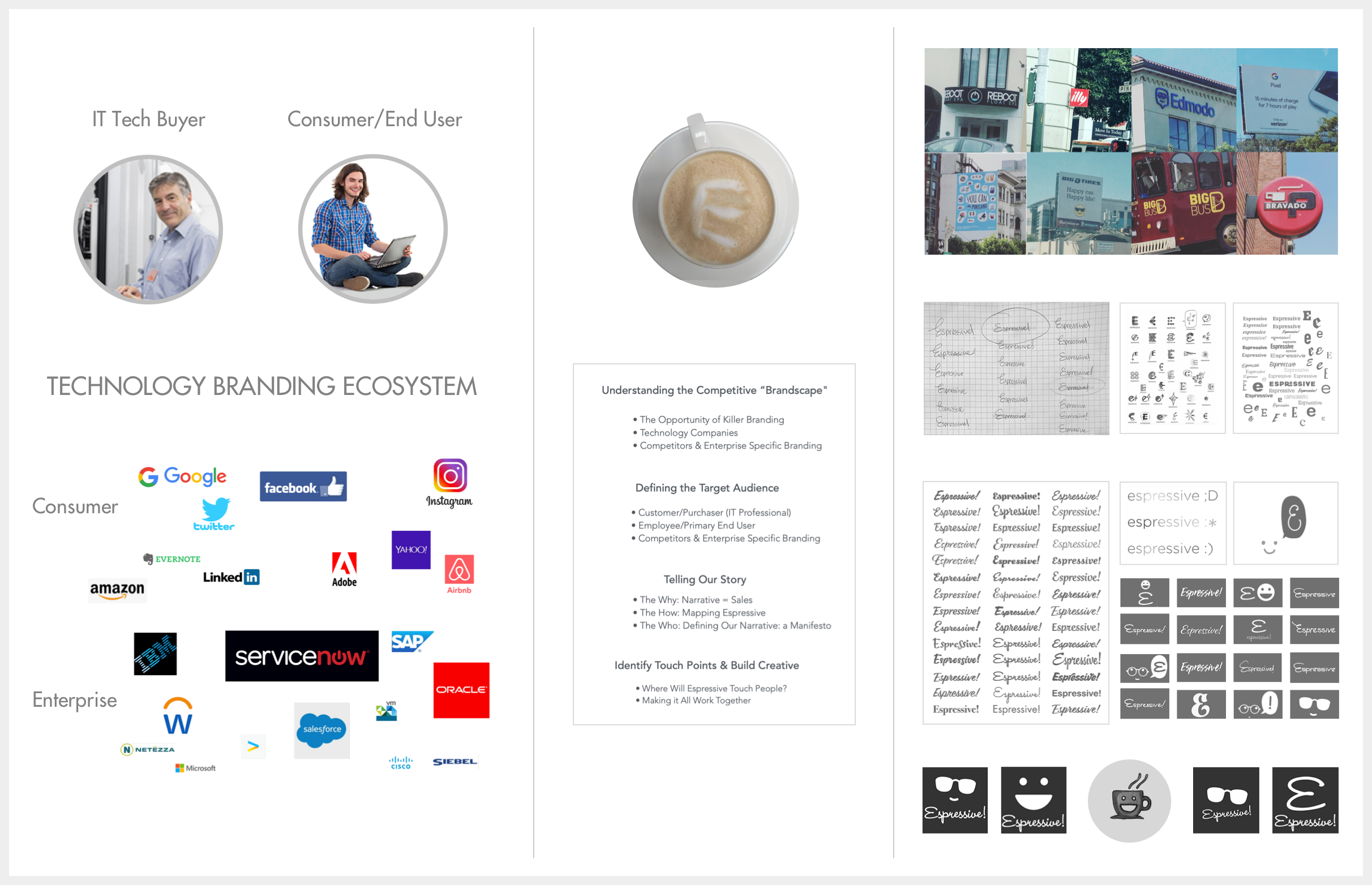
Espressive Brand Development
Branding: Core Objectives
Create a differentiated, unique and memorable consumer-facing brand for Espressive that stands out in the B to B landscape as customer-focused, consumer-friendly, conveying the personable service-oriented nature of our product offering.
Strategies
-Develop an emoji-centric chatbot character to personify the brand values of Espressive: Personable, Witty, Intelligent, and Helpful. Use the universally understood metaphor of the barista and coffee to convey high-touch human service and productivity in work culture.
-Create adaptive versions of Barista to maintain brand recognition across in-app and marketing touchpoints, highlighting different aspects of the character depending on the context.
-Provide a solution that eloquently balances the need for corporations to brand their enterprise applications, without subsuming or eliminating the opportunity for Espressive to be known to the end user from within the application environment.
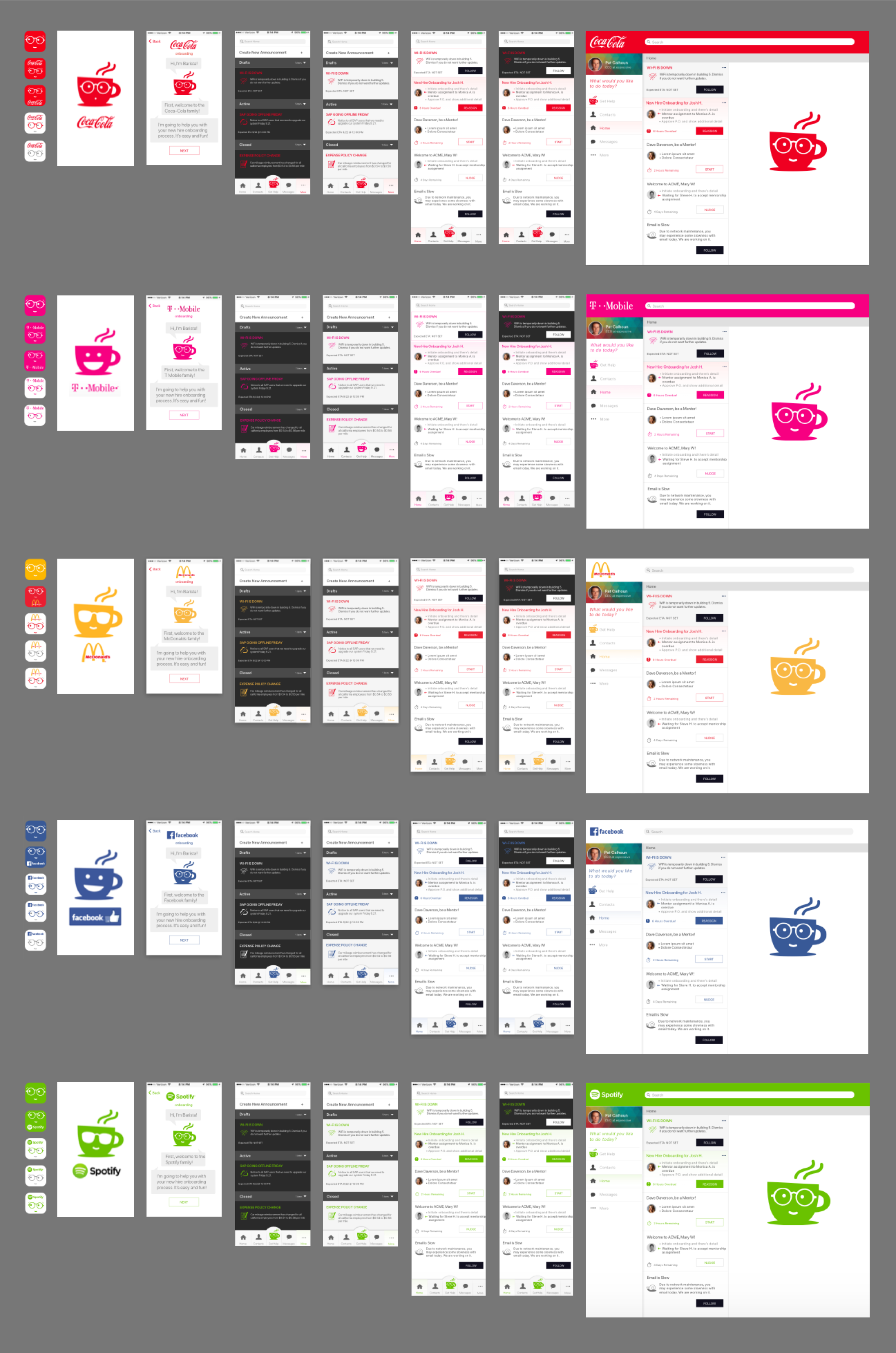
Co-Branding: Barista maintains the brand expression for Espressive, while wearing the primary colors of the enterprise.
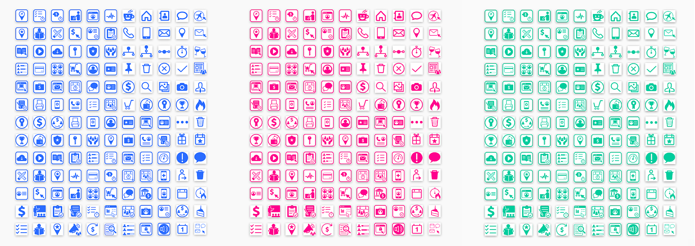
The full icon SVG set for the Espressive App, dynamically skinned in corporate brand colors.
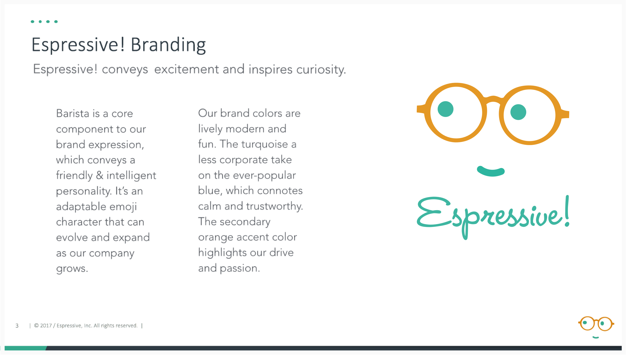
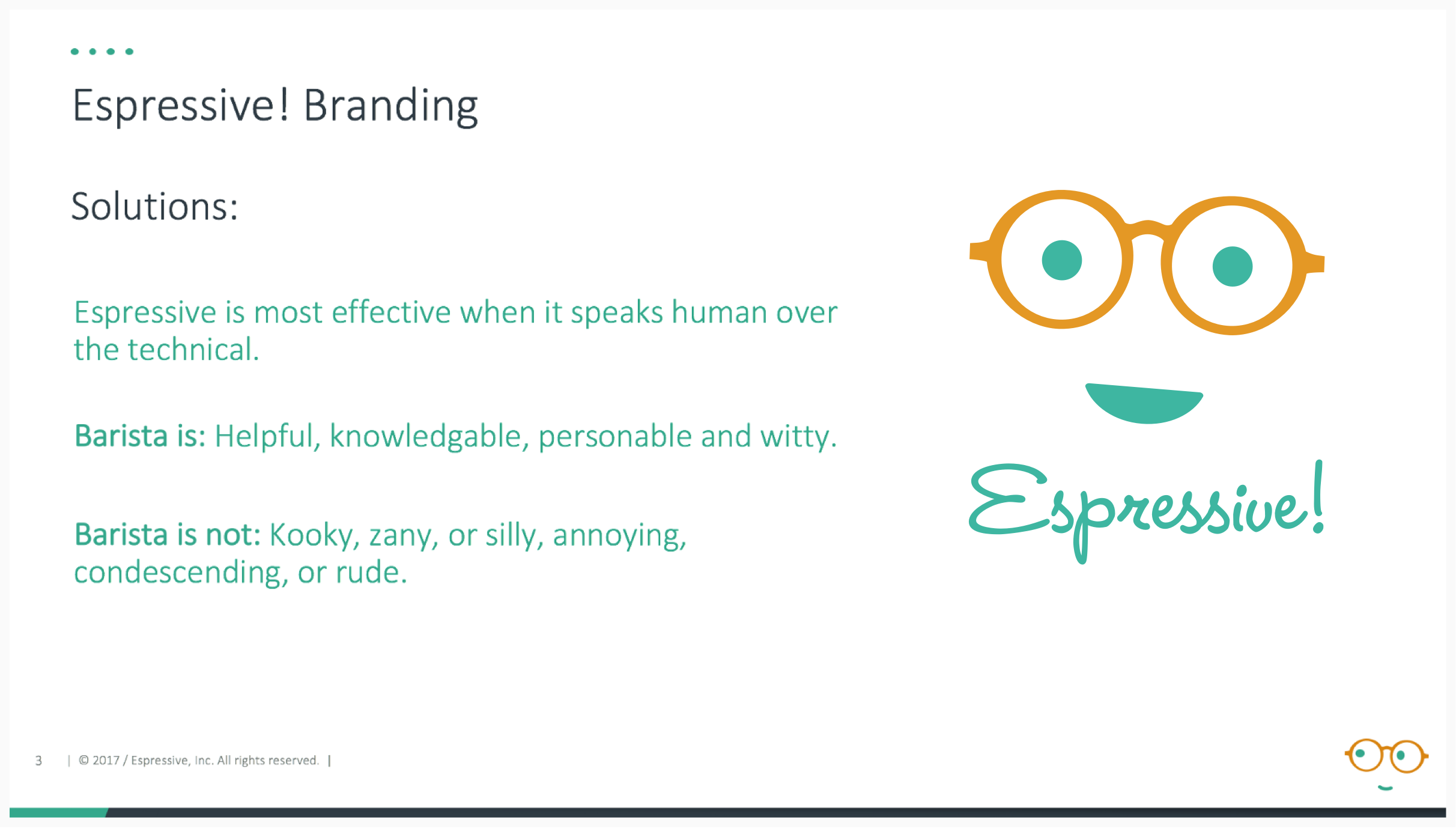
The Star of Espressive: Barista! In-App vs. Marketing personas. Can you tell the difference?

Hint: The Coffee Cup makes better sense inside the application experience, when you’re interacting with Barista. Outside the app, the brand functions more succinctly without the (potentially confusing) coffee metaphor.
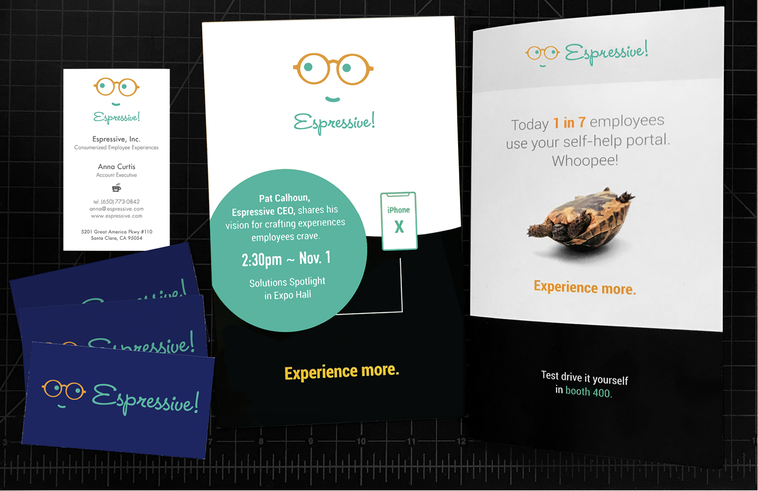
Espressive Collateral
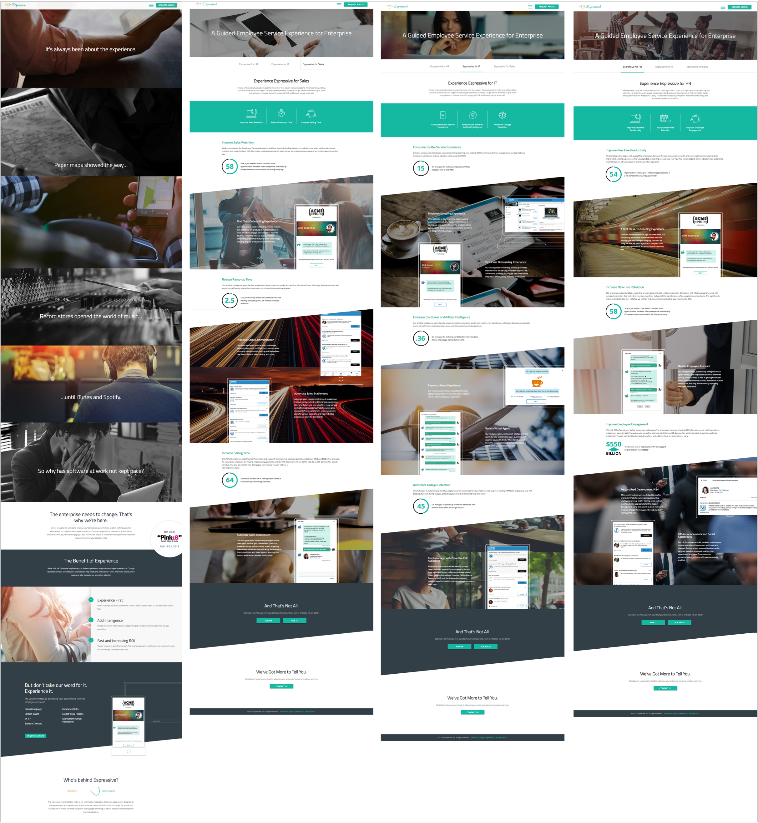
Espressive Website 1.0
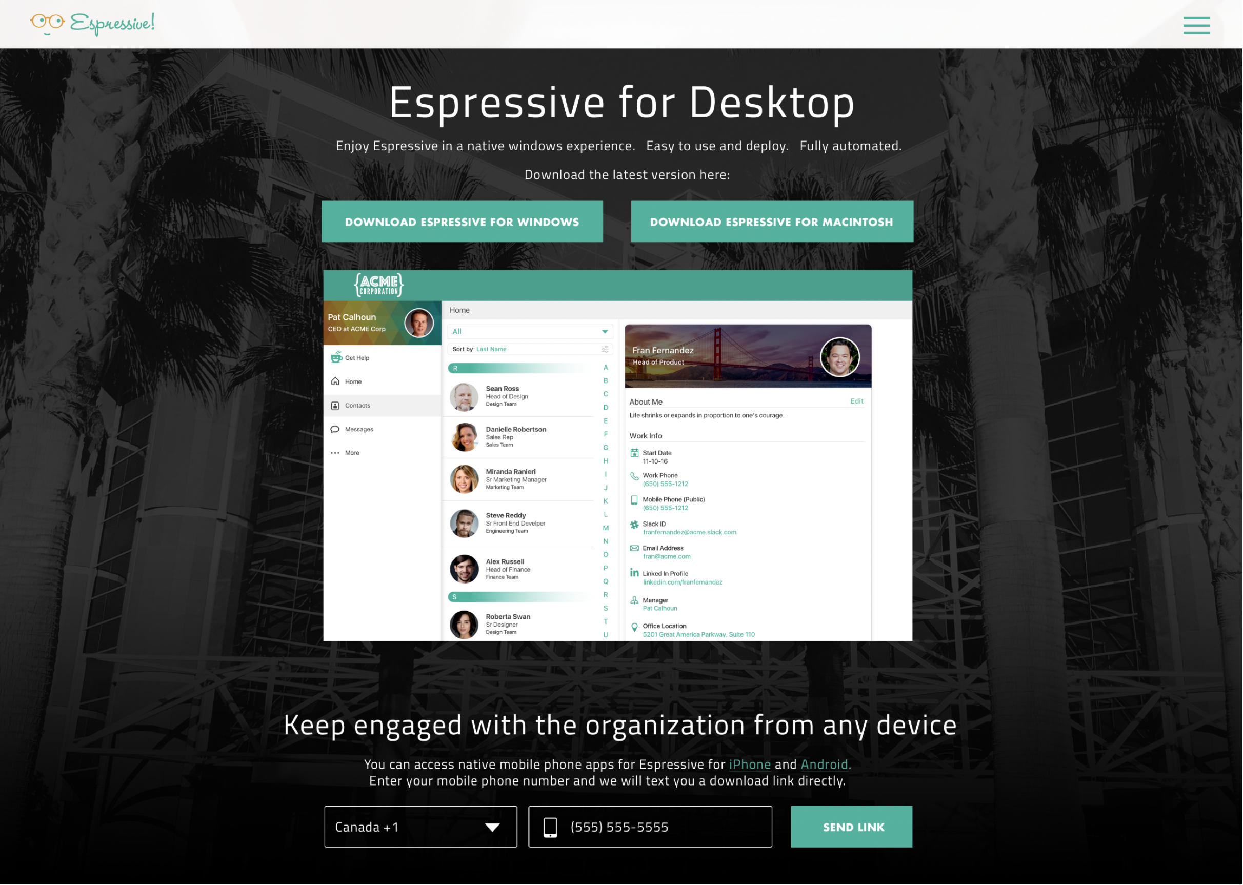
Espressive Website 1.0
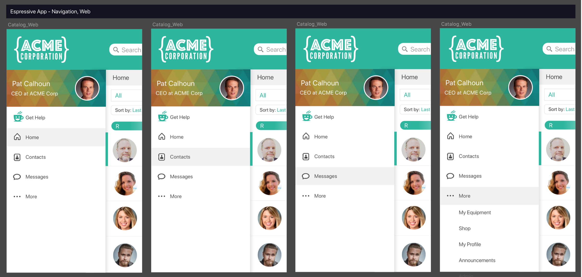
Espressive App Navigation
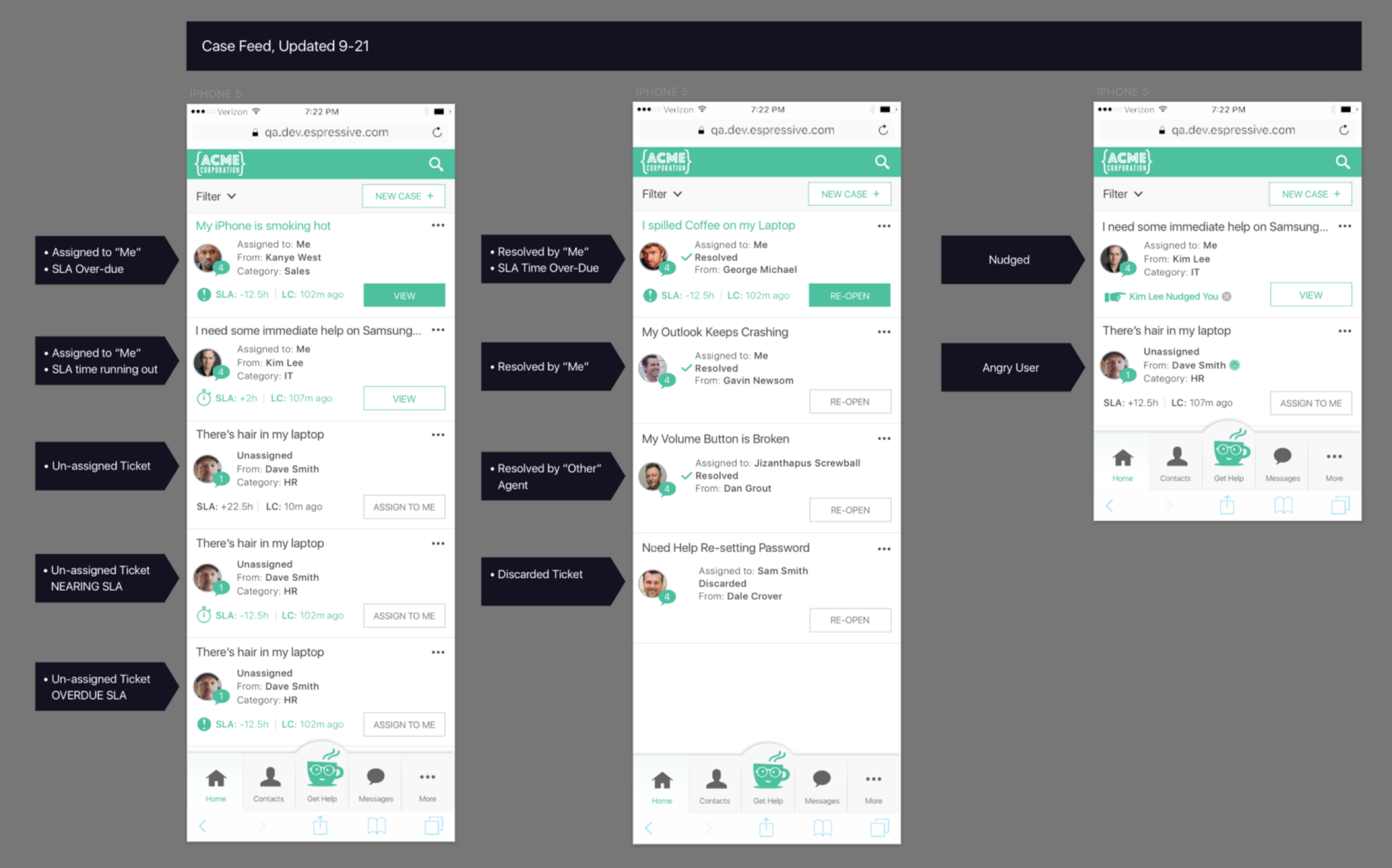
Espressive Case Feed
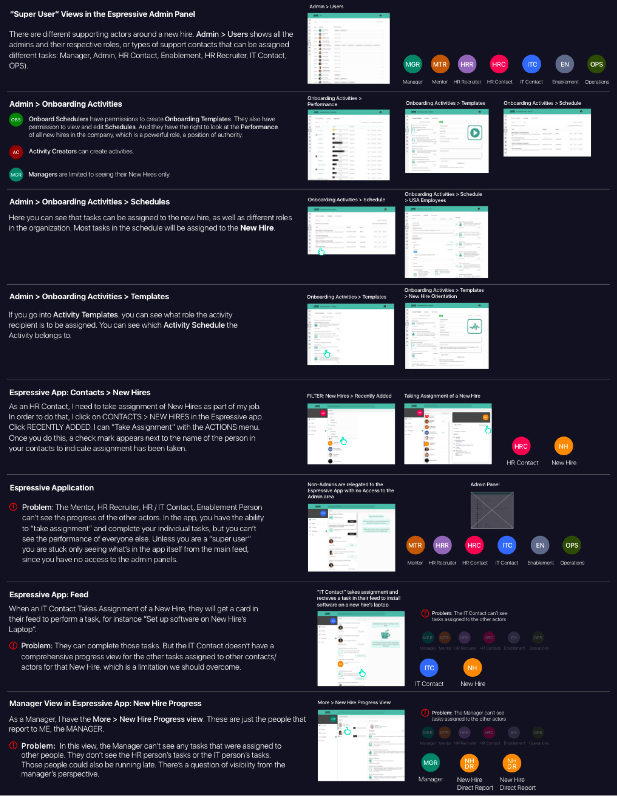
Espressive Manager/Admin View UX
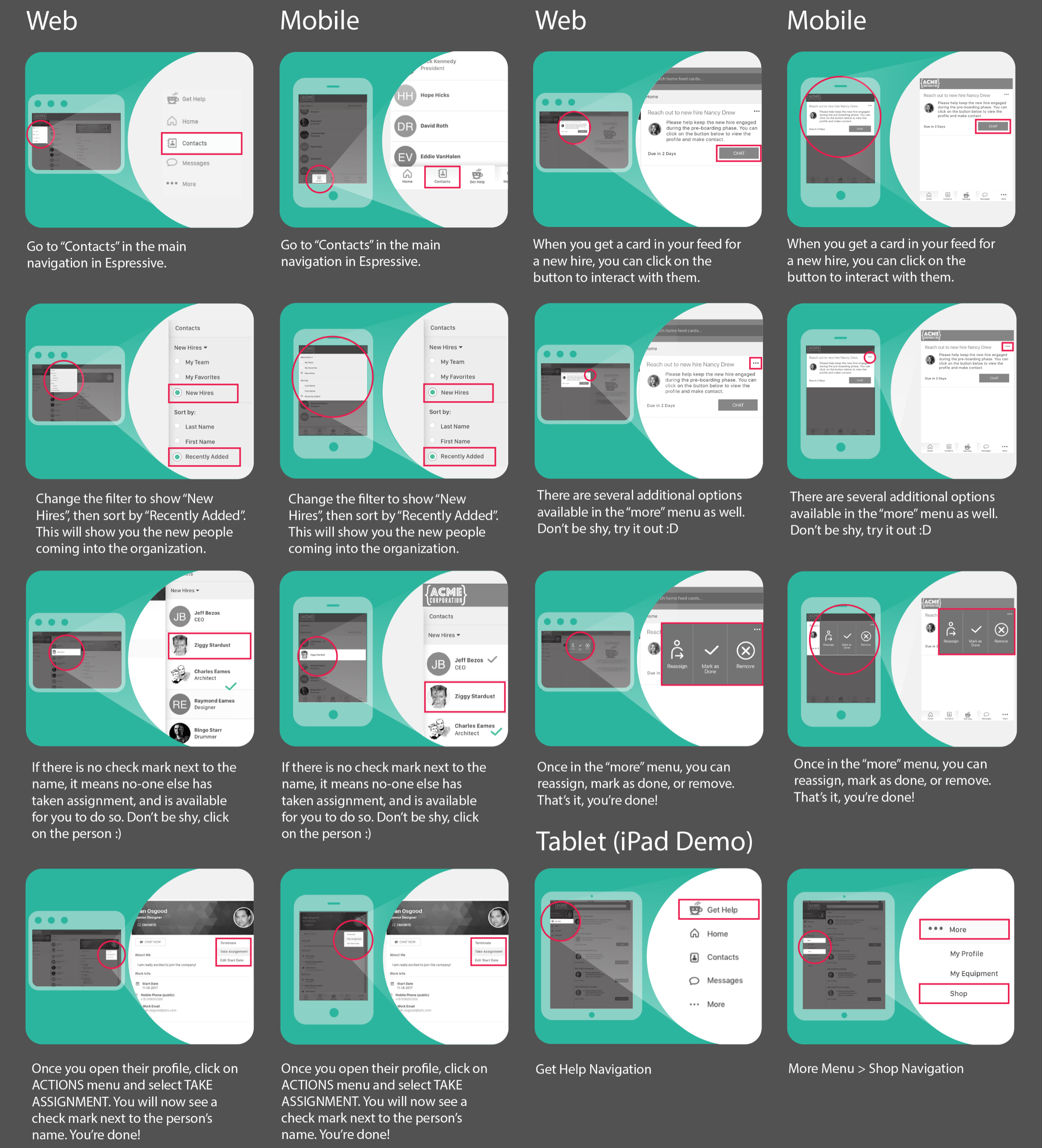
Espressive “Show Me How” Instruction Cards
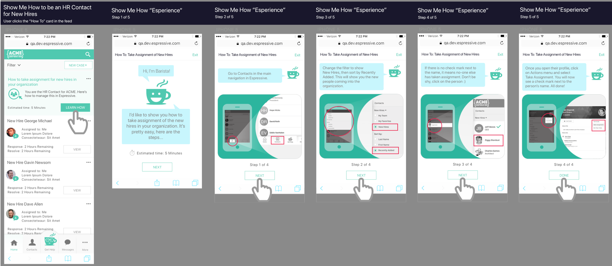
Espressive “Show Me How” Workflow
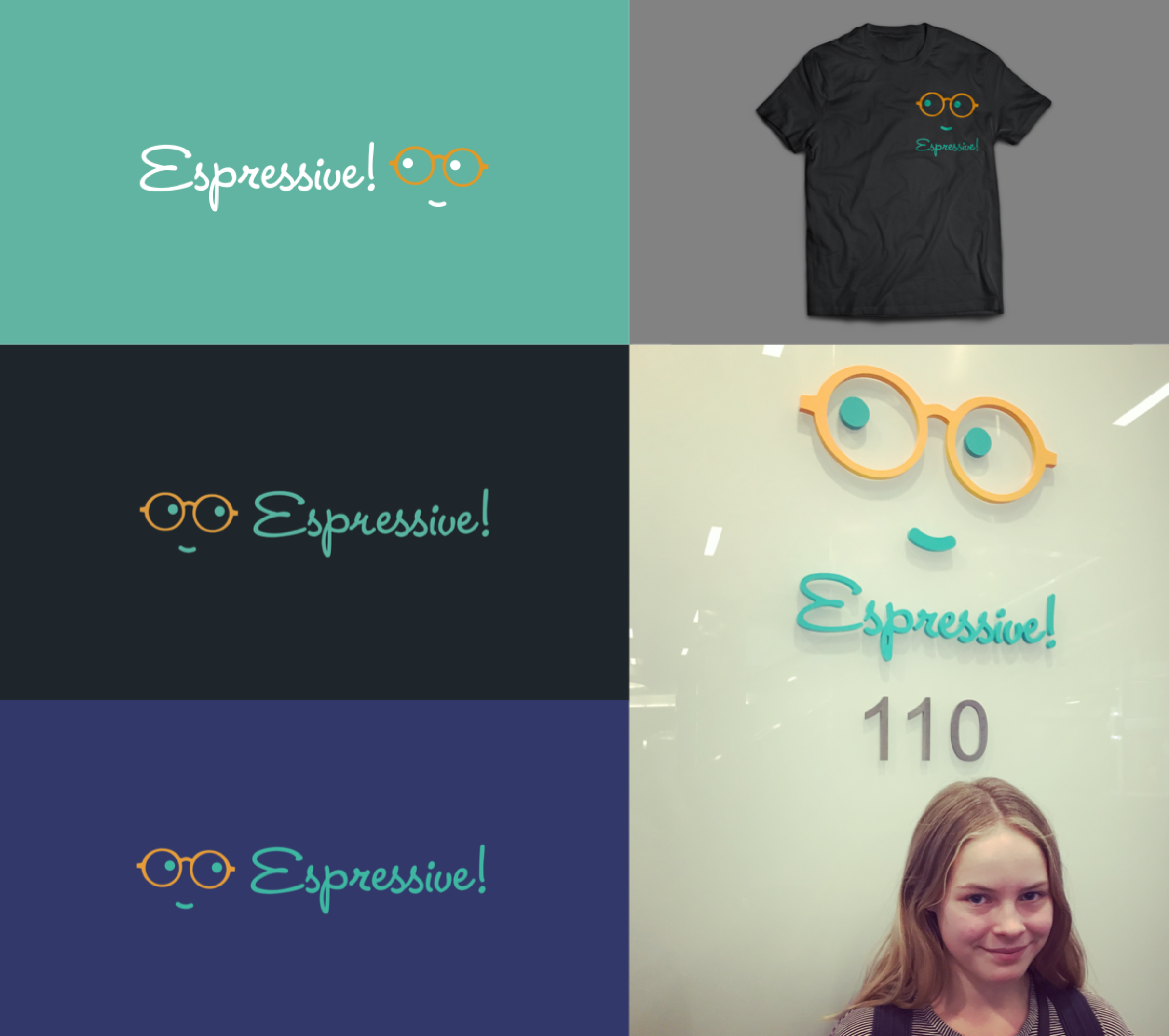
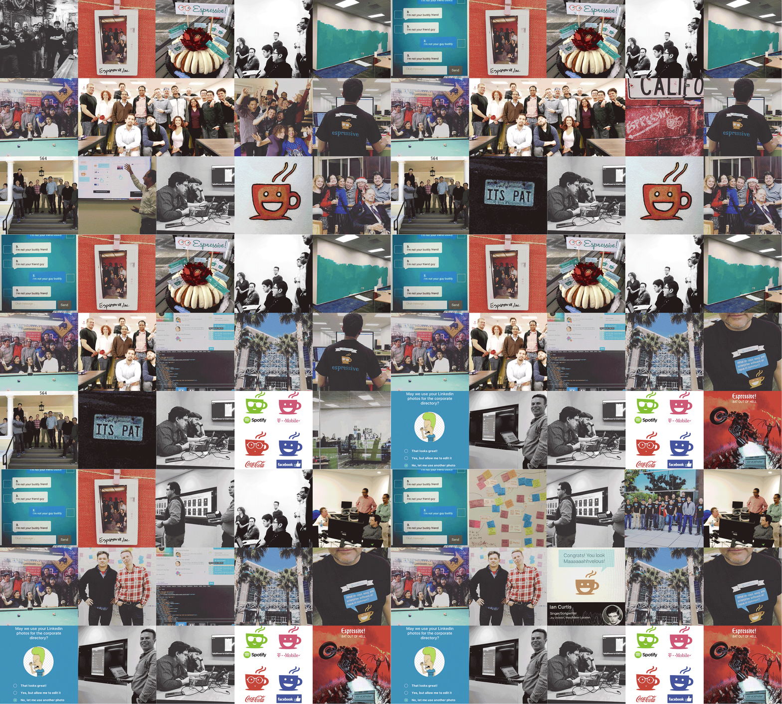
Espressive Life
Testimonial Videos
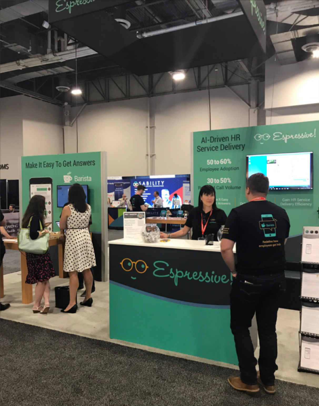
Espressive Trade Show Booth
